

Hello! I’m Max – currently the Principal Product Designer @ Checkatrade.
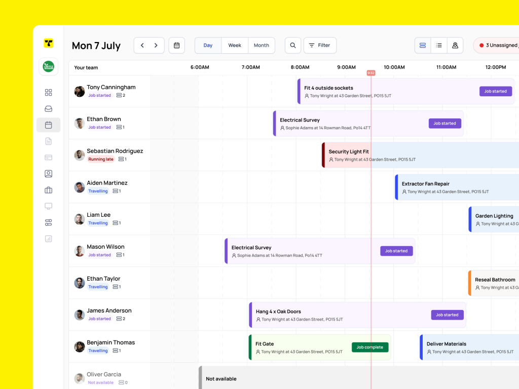
TradeMore AI
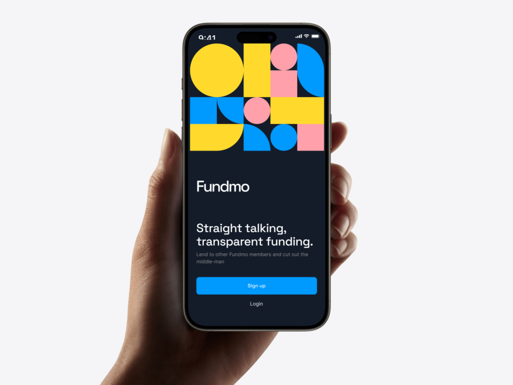
Fundmo
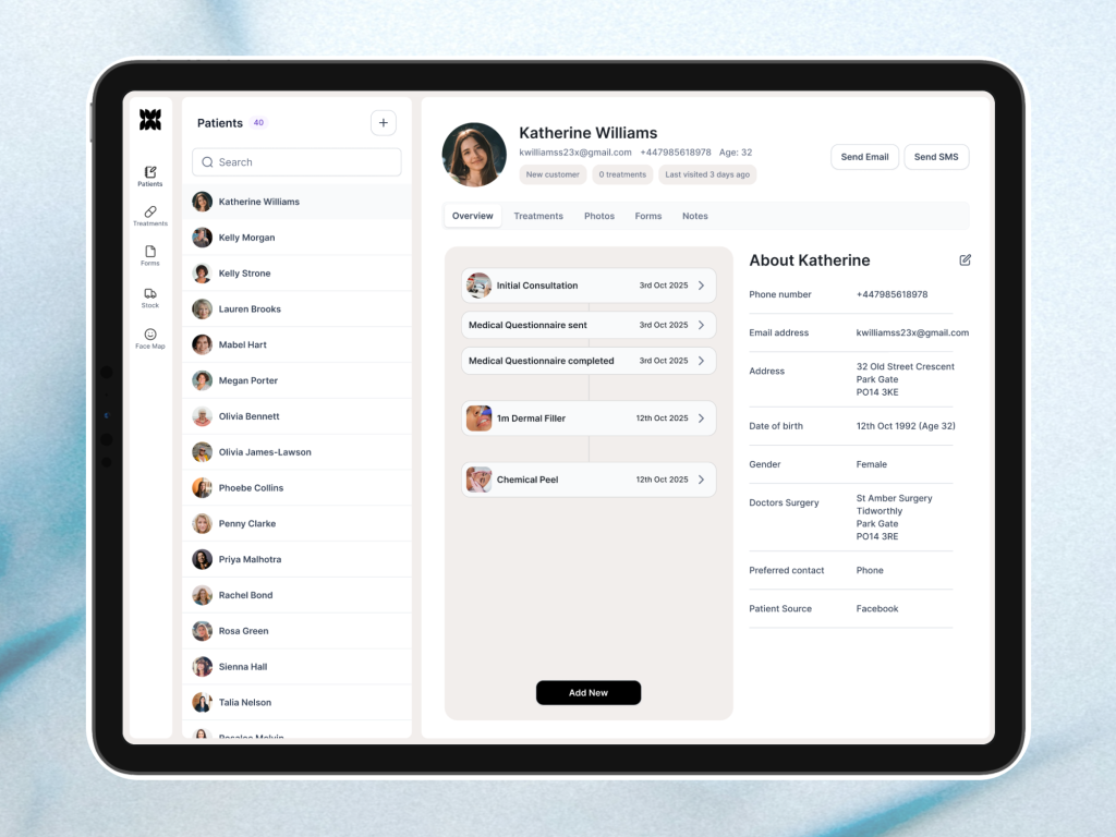
AestheticRM
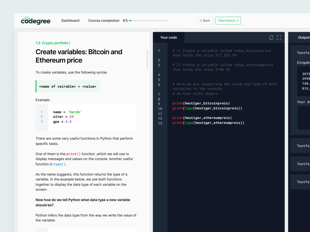
codegree
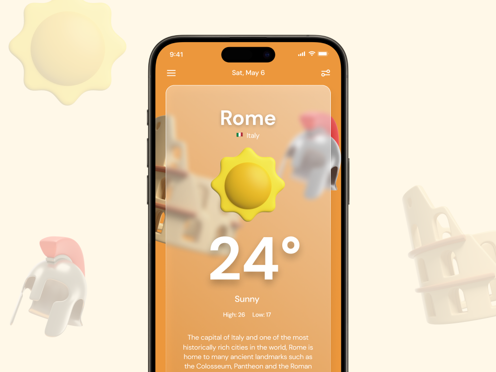
The Random Weather App
Acryno To
Leadr
Kernel Journal
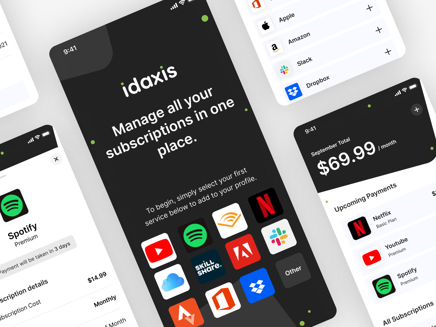
Idaxis
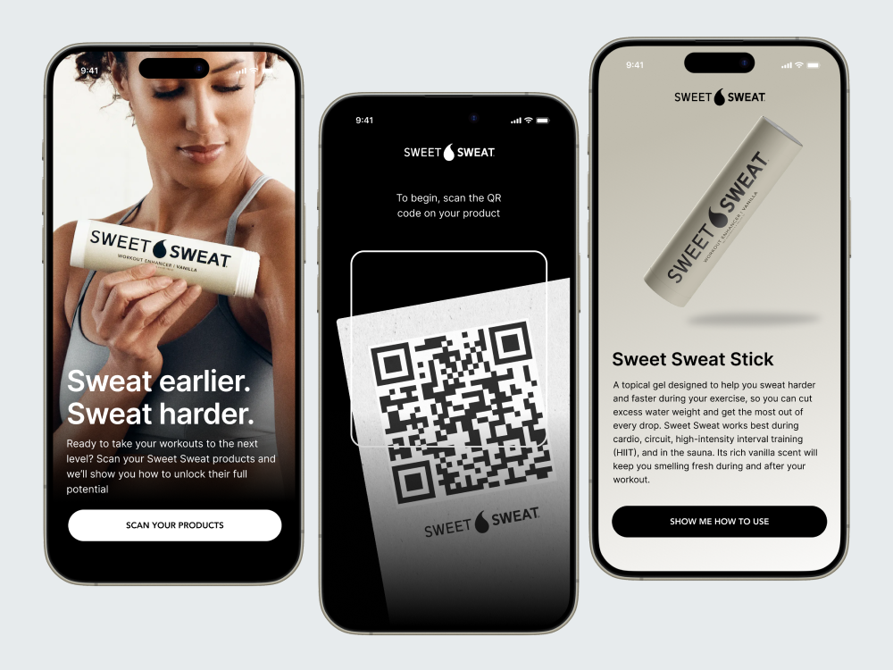
Various Concepts
More about me
With almost 10 years in UX, Product, and Visual Design, I’ve built a career around pushing boundaries, elevating design standards, and crafting intuitive digital experiences. As a product design leader, I blend strategy, storytelling, and emerging technology to create products that don’t just meet user needs, they delight and inspire.
I’m a firm believer that great design is more than aesthetics, it’s about creating experiences that feel effortless and meaningful. Whether leading teams, refining design systems, or pioneering new AI-driven interactions, I stay hands-on to ensure every detail aligns with a bold vision of the future.
Beyond the work, I’m passionate about mentorship, fostering creative teams, and shaping the next generation of designers. I’ve spoken at conferences on AI, Design Systems, and the evolving role of design in technology, sharing insights that drive industry conversations forward.